For our Motherhood edition, which explores both the personal and political sides of the experience, visuals editor Lara Antal knew that they didn't want to only picture mothers and babies. But how did she land on blankets as the thing that tied it all together? Read on to discover more on their artistic process.
How did you approach developing the visual identity for this edition?
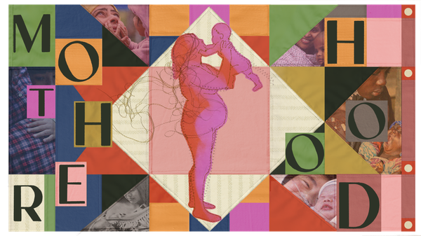
Lara Antal: The concept of motherhood is as expansive as the world itself, and so the visual theme had to be just as versatile; ubiquitous, widely cultural, and deeply personal, all at the same time. The answer was the blanket. Designed through quilted, patchwork, dyed, and countless other techniques, they are a visually rich and diverse object. The act of blanket-making, and the blankets themselves, have often been passed down through generations of women. These creations are affirmations of a way of life; cultural traditions, made visible through unique patterns and processes.
Using them in ‘high-design’ is a feminist reclamation of a world that dismissed these art forms as merely ‘women’s craft’ (see Judy Chicago’s The Dinner Party). But at their most essential level, blankets are symbolic of caretaking. Say the word, and it brings to mind images of mothers swaddling babies. Blankets can protect, shelter, and provide warmth. But they can also smother or wrap too tightly. Blankets can, over time, be lovingly used and worn. Or, under harsher and unkind conditions, be torn and unraveled. A blanket holds within it the history of countless communities and people.
As you worked, what did you learn, related to the theme of the edition, that most surprised you?
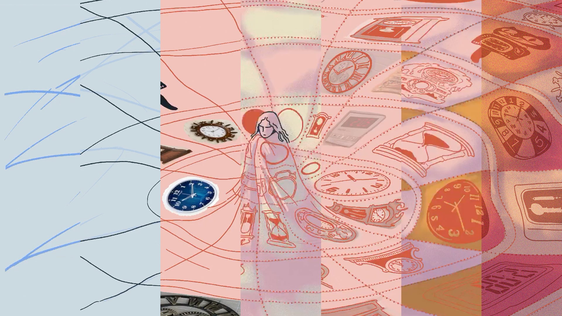
I was delighted to find that the visual theme was flexible enough to incorporate multiple artists' approaches. For my contributions, I was able to work in different styles, using collage for the key image and traditional illustration for an op ed piece.
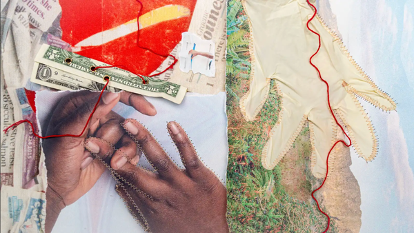
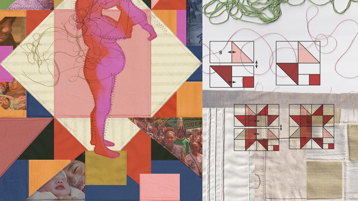
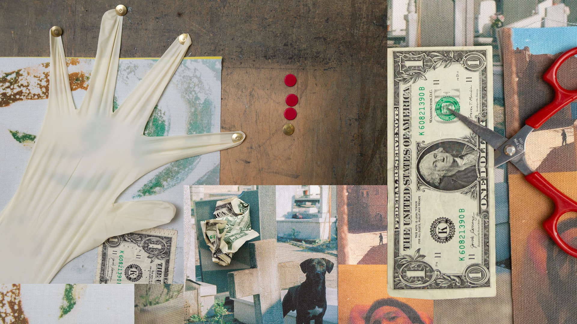
When I reached out to our guest artist, Nathalie Basoski, I had an idea of how she might translate the theme. Again, I was happily surprised by the result. To use a simile: a successful art director-artist relationship is like sourcing well-known ingredients for a chef, and they find a way to create a dish full of novel, unexpected flavors. Basoski’s collage blurred the boundaries of 2D and 3D. Crafted through a process that stitched fabrics, photos, string, and even currency together, each iteration and edit brought something new to the surface. Her final photographic piece blended layers of meaning seamlessly into one image.
Were there any concepts you loved but had to leave on the cutting room floor?
The great thing about the theme is that there were infinite ways to express it. So, rather than feel like things were cut, I lamented not being able to explore every idea. I wanted to incorporate blanket schematics and design patterns more, or try to visualize data in woven styles. But there is only so much time in the day!
Lead visuals by Lara Antal. Edited by Charlie Brinkhurst-Cuff and Eliza Anyangwe
Lead visuals by Lara Antal. Edited by Charlie Brinkhurst-Cuff and Eliza Anyangwe